check this out
Monday, February 25, 2008
Wednesday, February 13, 2008
Monday, February 4, 2008
MY bad TyPE PaGe
http://www.radiohazak.com/
while I like what the site stands for i dislike the set up
while I like what the site stands for i dislike the set up
Saturday, January 19, 2008
useful document that i found
HERE is a useful PDF that I found while doing a little more research for the homework.
Wednesday, January 16, 2008
what I see as good and bad typography

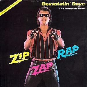 I feel that this first image on the top is an example of good typography and graphic design. the images used are compelling and interesting to look at, and the important information in conveyed... With this image I can find many things that draw my attention and that keep my interest...
This image under the other one however is a disaster on many levels... I will try to avoid going into the many things that I feel are an affront to my sense of sight and focus on what makes this a nightmare of horrible typography and graphic design... I feel that this image is too formulaic in its layout, in that it symmetry seems too intentional rather then natural... The color use is too faddish( I feel that if People like an image just as much if not more ten years latter then it is much better then one that is only trying to play upon the flavor of the week ) Also I dislike the word choices used in this image.
Monday, January 14, 2008
Hey ya'll
Just looked at font foundry and thought that it was ok... I like the look up of the site however I am not as thrilled about the navigational aspects of the site... the site that i normally use is called acid fonts and i think has a much better navigational setup.
Thursday, January 10, 2008
Fun font...YEAH...CONT.
I'd say that this font is a sans serif font with an interesting twist, and that is the vertical lines over the letters. I think this font might be a good font to use to partially hide your text, as the lines over the letters draw the attention away from the text. this might be useful when putting your name some where on a piece with out it being obvious.
Subscribe to:
Comments (Atom)