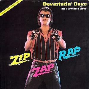
 I feel that this first image on the top is an example of good typography and graphic design. the images used are compelling and interesting to look at, and the important information in conveyed... With this image I can find many things that draw my attention and that keep my interest...
This image under the other one however is a disaster on many levels... I will try to avoid going into the many things that I feel are an affront to my sense of sight and focus on what makes this a nightmare of horrible typography and graphic design... I feel that this image is too formulaic in its layout, in that it symmetry seems too intentional rather then natural... The color use is too faddish( I feel that if People like an image just as much if not more ten years latter then it is much better then one that is only trying to play upon the flavor of the week ) Also I dislike the word choices used in this image.
1 comment:
His jeri curl is an atrocity on many levels, but there's no stopping people from "looking the times." With the words, I don't understand what's going on. Is that the title? what's the title?
Post a Comment